Sunday 26 January 2014

Final Essay Raoul Hausmann and Jamie Ried

Raoul Hausmann was a key figure in the Berlin Dada movement in the early 20th century. As a an Avante Garde artists in the Dada movement he adhered to the philosophies behind Dada, being the anti-art and against social and cultural traditons after the first world war. The aim of the Dadist was to change society's image towards art and culture through their work. Hausmann belived in the 'The notion of destruction as an act of creation was the point of departure’

The dadist sought to look towards the future by restoring the errors of the past and conform to a new ideology toward culture. As an artist Hausmann made use of new technologies which emerged in the Dada movement. Hausmann's work made use of the new technique of photo montage which was pioneered by the Dadist and also incorporated found material in his work. At the time these were new an innovative aspect which started to emerge in art. The use of ready mades and collages was in line with the anti art mentality as they also wanted to move away from traditional art tools and techniques. The development of the new techniques was a crucial aspect that effected society and they could have an updated view towards art. Also a n important aspect of Hausmann work was the way he portrayed type and cut outs of different typefaces which at the time was was regarded as an innovation for art. The common notion at the time is that art was simply aesthetic imagery. The fact that the use of type started to emerge shows the dadist re interpretation of art their society. The dadist work spread to different field of art including music , expressive art and literature which would widely span its effects on society

Another artist who believed in a similar ideology of Hausmann and the Dadist was designer Jaimie Reid. Reid is an English artist which work emerged in the early to mid 1970’s In the punk sub culture. Like the dadist the punk ideology was based against society. They believed in anarchy and wanted no part with tradition conformities. The punk movement was directly influenced by a Punk music band the Sex pistols which also believed in this ideology. At the time the young emerging society followed and was influenced by the sex pistols and this allowed Jamie Reid art to also effect society as he was responsible for designing their album covers. Like Hausmann, Jamie Reid made use of different type faces which would be collaged on his imagery similar to Hausmann. Also Reid made use of photomontage and collage techniques which were previously developed by Hausmann and the Dadist which reflects on the similarities w these separate styles have in common. Reids work would mainly involve images of important figures of culture and society which are in political or powerful positions incorporating ironic slogans which served as a symbol against the rule in his work. The use of using irony would effect the people who viewed his work which could influence their belifs and open their eyes to the issues in their society.


References

http://ashleighberryman.wordpress.com/tag/jamie-reid/

http://www.dada-companion.com/hausmann/

http://www.theguardian.com/artanddesign/2012/mar/26/british-design-modern-age
 
accessed 26/1/2014 22:00

Group work Presentation

The following is the structuring process of the group work presentaion. My group consisted of researching 2 modern art movement along with my colleges Rhys and Noel. The topic we had to undertake in the presentation were constructivism and De stijl which are art movements that emerged in europe in the early 20th century.

The first step to undertake the presentation consisted of planning and dividing the work amongst each other. As a starting point I volunteered to create a layout of the presentation which would aid use in the planning strages of the presentation.
below is a photo of the presentation layout and the division of work for each group member.


After having determined the layout and the number of slides the next step was delegate with each other to divide the work load in order to gather research for the presentation. In my case I was tasked to research 2 important artist of consrtructivism and de Stijl, being Alexander Rodchenko and Piet Mondrian. Also this factor would be the topics I had to discuss in the presentation.


Above is the process of research I gathered which would would be placed in the presentation. The final aspect was after compiling the evidence we would meet and put the information in a Prezi which would be submitted and finally which would finally be addressed infront of the class.


finalisation of InfoGraphic


Above is the Final outcome of the infographic which outlines 5 different movements from japanese print to punk. overall I am pleased with the layout and the aesthetic visual of the infographic. the use of countries represents the boundaries which differ from the syles which directly influeced each other over the years. Also the use of colour serves as a crucial aspect as it shows respective style. Colour was also used for the text which is  scattered around the page, these word are colour co ordinated and are placed in all of the segments. The similar aspects of the styles has been joined using coloured text and simillar text will have similar colour. this approach provides the viewer to identify similar elements which were of influence to the styles.

Infographic design idea # 3

After having sketched 2 layout design ideas the road to finanlising the infographic was near. The second geometric idea was the basis for the next layout idea as incorporate the 3D element which I was pleased with. proceeding through the researchthe next idea came to my head. The fact that the chosen styles have emerged from different countries provided me with the idea to replace the geomethric cube /shape which would hold the information with the country that the style emerged from.This would be useful as the styles would be divided according to the nation which would show a transition from different cultures. the sketch seen below is a 3D represantation of France which serves as a gudline.


The respective countries would be place next to each other and vary from each other in a chronological stand point from the different heights to one an other. This concept of hierarchy was already established in idea # 2. the overall layout would be portrayed as seen below. the cubes represent the different countries 


Above photos represent the finalised idea which was developed further incorporating all the chosen styles and appointed colour scheme to ease legibility and to contrast the movements.

Infographic design idea # 2

After the first sketches were made the next step was to expand other ideas as not to base on just one option. The matter to the fact was that I was not 100% sure on the first idea and was not happy with the outcome. The next step was to go back and sketch a different idea for the layout.

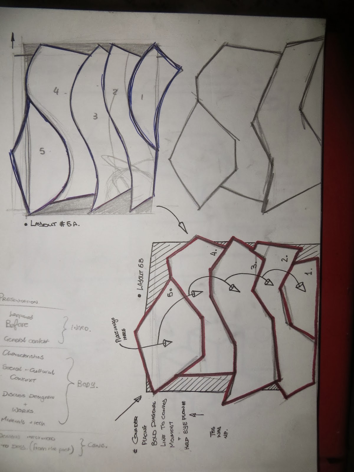
The second idea main aspect was to make use of geometric layout. I started sketching geometric shapes which would serve as the main area to insert the information. The geometric approach to the layout led to the following sketches which can be seen below.


As can be seen above the sections for the styles are made up of distorted polygon shapes. The new ideas still had similar aspects to the first sketches. The next step was to develop the idea further and by doing so i managed to incorporate 3D element tot the  idea of using geometric shapes and the outcome can be see below


the raised shapes would be used to enclose text and imagery and another aspect to the idea is that the different height between each segment would be higher then previous to emphasis the difference of time between the style. The earlieststyle would be placed in the lowest segment and further along style will be placed higher

Infographic design idea # 1

The first task that in the process of creating the finalised infographic was to first determine the overall visau; layout of the infographic. I started by sketching some ideas of the layout on a piece of paper.

The first approach towards the layout mainly involved using a spiral (golden rule) layout which would serve as the gudline to follow. the information would be placedaround the centre section which would serve a s the earliest art movement and the other movements would spiral around. This would be useful as to emphasis and to show the hierarchy of information
In the photo scene below illustrates the idea of and also incorporates different layout which still have the same principal.


After having analysed the ideas the next step was to develop them furthure but still keeping inline with main concept. After more sketching i combined the three layouts see above and came up with the following developed idea which would suit the concept perfectly


The developed version combines the same idea but the section in which the information would be placed are now overlayed one over the other. The sections are given numbers to show the sequence to which the movements progress through the ages. Also incorporated in the sketch are the main issues to research and the chosen and identified which will be researched in depth in later stages.

Banksy

Banksy is a United Kingdom-based, graffiti artist, political activist, film director, and painter. His work involves satirical street art and subversive epigrams combine dark humour with graffiti executed in distinctive stencilling technique. Such artistic works of political and social commentary have been featured on streets, walls, and bridges of cities throughout the world.


Banksy's work was made up of the Bristol underground scene which involved collaborations between artists and musicians. Banksy displays his art on publicly visible surfaces such as walls, even going as far as to build physical prop pieces. Banksy’s Stencils are traditionally hand drawn or printed onto sheets of acetate or card, before being cut out by hand. Because of the secretive nature of Banksy's work and identity, it is uncertain what techniques he uses to generate the images in his stencils, though it is assumed he uses computers for some images due to the photocopy nature of much of his work. Banksy has also made films and he made his own film i n 2010 ‘exit through the gift shop’ which documents the life of other graffiti artists along with his work in the urban street art scene.


References