Sunday, 26 January 2014

Josef Muller-Brockman

Josef-Müller Brockmann, is said to be the father of Swiss Graphic Design, Brokmann’s work had a large impact upon the profession of graphic design. He is one of the most influential figures in Graphic design history and his professional contributions make him a recurring figure in books and editorial design. Brookman’s first studied architecture,design and history of art at both the University and Kunstgewerbeschule (school of arts and Crafts) in Zurich. Brokmann was also strongly influenced by designer Moholy-Nagy’s photography and Jan Tschichold’s rules of typography. ( both New typography movement).
 He began his career as a graphic designer as an apprentice to the designer and advertising consultant Walter Diggelman . In 1936, he left the advertising company and establishing his own Zurich studio specialising in graphics, exhibition design and photography. As a graphic designer, Müller Brickman’s used different techniques which included letterpress, silkscreen, and lithography.                                                                           Brockmann’s work revolved heavily on geometry and the use of the Grid, which produced a sense of Constructive graphic design. His approach toward the use of grids determined the organisation and arrangement of the type and images, which allowed better legibility. The grid is the hidden element that structures the composition as a whole.


Josef muller brokmann use of grid has been one of the greatest contribution towards the graphic design profession. He was the pioneer of design structure which will influence designers to use it and to break away from it in the years to come and still crucial to this day and age.

References.
http://guity-novin.blogspot.com/2011/07/chapter-42-swiss-grade-style-and-dutch.html
http://www.modern-theory.com/directories/muller-brockmann-josef/
http://www.agrayspace.com/ncsu/04_fall/img/Brockmann.pdf
http://www.pinterest.com/wakingup55/josef-muller-brockmann/

accesed 22/1/2014 2000

INTERNATIONAL TYPOGRAPHY

The International Typographic Style or Swiss design originated in Switzerland in the 1940s and 50s after World War 2. The Swiss typographic style was the basis of much of the development of graphic design during the mid 20th century. The International Typographic style developed and was influenced by previous avant-garde design, combining elements of Russian constructivism, Dutch De Stijl, New Typography t and the Bauhaus. The overall impression of the new style revolved around simplicity and rationality, tightly structured, clear, objective and harmonious.

Swiss Design view toward graphic design was to present complex information in structured and unified manner. The use of the Grid was a strong concept for the Swiss Designers. The pioneer figure which highly contributed and evolved the style were Ernst Keller, Theo Ballmer, Max Bill and Max Huber. Their work characteristics included reliance on the grid layout, the use of San Serif typeface (Helvetica 1961), narrow text columns which were set Ranged-Left and photography serving as the only source imagery on the page.


Characteristics of the style

The use of a mathematical grid
sans serif typefaces (especially Helvetica, introduced in 1961)
flush left and ragged right format; and
black and white photography

The international typographic style popularity starting growing and it extended till the 60’s and 70’s when new influences evolved the style further thanks to the influence of l designers Emil Ruder and Armin Hofmann (the Basel School of Design) and Josef Muller-Brockman(Zurich School of Arts and Krafts)  which refined the style and brought it in to a new level of sophistication.


The International style was to set the graphic design guidelines which would influence later styles. Spanning to the post-modernist style having evolved and manipulated and part of the corporate design  suggest further influence for the future of Graphic design sector.


The Thames and Hudson
 Dictionary of Graphic design and Designers
1992-98 Thames and Hudson Ltd, London UK


All accessed 22/1/2014 1830

New Typography Movement

The new typographic style started in the 1920s and 1930s, the so-called New Typography movement was a main factor and contributed graphic design and informational art of the artistic avant-garde in Central Europe.

El Lisstzky, a main figure in the constructivist artist played a major role and was considered a key figure in the development of the New Typography movement, he was one of the first designers to abandon the classical rules of typography and made use of  asymmetrical layouts, geometric shapes, a limited range of colours, and sans serif letter-forms.   He's considered the first person to apply modern art techniques to typography.   Lisstzky's principles will influence Maholy-Nagy and applied these graphic principles to the Bauhaus.

The main principles and characteristics of the New typographic style was a rejection to traditional arrangement of type in symmetrical columns, t designers started to organize the page or poster as a blank field in which blocks of type and illustration (frequently photomontage) could be arranged in harmonious, strikingly asymmetrical compositions. 
Contents in their designs would be arranged according to hierarchy.
Intentional use of white space was also evident and one of the main factors of the style.
Typefaces were strictly Sans Serif to accompany the geometric nature of the modernist philosophy. These new principles were important factors for paper size standardisation.
The new typographic style main artist included Jan Tschichold, Max Bayer, Ladislav Sutnar, Kurt Shwitters and Piet Zwart.

zwart1

bayer2


tschihold1

sutnar2

schwit1
rod1       


Jan Tschichold was a crucial figure of the new typographic style and in 1928he published his book, 'Die Neue Typographie' (German for "The New Typography). He aimed to make guidelines for a new era of typography in a time were the emphasis was on beauty and aesthetics Tschichold wanted to move away and change the traditional notions and introduced the principle of clarity and functionality. These guidelines helped with attaining clear, functional, and simplistic type that would also enhance the legibility of printed literature. Tschichold new guideline provided functional typography and its methods were quickly adopted be many printers and designers. This is when the New Typography movement really began to take off.
Jan Tschichold was responsible in creating new fonts in the mid early 20th century and the most famous typefaces he designed include
Typefaces Tschichold designed include: ‘Transit ‘(1931), ‘Saskia’(1931/1932), ‘Zeus’ (1931) and Sabon (1966/1967)


File:Sabon.png


The New Typography movement provided a much needed overhaul to typographic techniques in an age when new technology easily allowed typographers to experiment and adopt new approaches to arrange type on a page.  “Die Neue Typographie” by Jan Tschichold was the essential guideline that quickly caught on and helped birth a new era of typography.


References


The Thames and Hudson
 Dictionary of Graphic design and Designers
1992-98 Thames and Hudson Ltd, London UK


All accessed 22/1/2014 1400

Art Deco movement

Art Deco was established as Modern artistic style in France after WWI. Deco was highly influenced by industrialisation and technology which was transforming culture in the time. The new art style was influenced by Art nouveau but it distinguished itself and moved away from the organic motifs and adopted more of a geometric industrial look. The style combined traditional craft motifs with Machine Age imagery and materials
Art Deco represented luxury, glamour, exuberance, and embraced the technologies and machines.
Deco contributed to many areas of design in its time and was widely used in consumer products, which include cars design, architecture, graphic design, interior design, industrial design, fashion and cinema.This style flourished between the years of 1930 and 1940 and spread through the west.
 
Art Deco spire of the Chrysler Building in New York City;
designed by William Van Alen;
built 1928–1930.


File:Lempicka musician.jpg
Tamara de Lempicka, "The Musician",
1929 (oil on canvas).


Art Deco main characteristics include elements such as —geometric shapes, bold curves, strong vertical lines, motion lines, airbrushing and geometric patterns. In the 1930 the elements of aerodynamics started to emerge in art deco and this was the result with the obsession of manmade machines and their new obsession of speed and power. This new notion of aerodynamic would strongly influence train, automobile, and aeroplane design in the era.

Graphic design also adhered to these characteristics but made less use of ornate motifs and replaced them with striking geometric shapes, strong use of line in various angles and geometric patterns. Also the use of rectilinear typefaces was used which provided improved legibility.
Art Deco made an incredible impact on typography. A.M. Cassandre’s Bifur was a main typographer and created typeface for the era, the typefaces composed of thick base forms ornamented with thin filler lines.. Broadway and Peignot are two other Deco typefaces we see all the time.

                       
File:Peignot sample.png
Peignot typeface.

Broadway typeface


                     References
http://www.pinterest.com/thebigmachine/art-movements-art-deco/
http://99designs.com/designer-blog/2012/06/05/art-deco-a-strong-striking-style-for-graphic-design/
http://visualartsdepartment.wordpress.com/deco/
http://gds.parkland.edu/gds/!lectures/history/1925/artdeco.html

The Thames and Hudson
Dictionary of Graphic design and Designers
1992-98 Thames and Hudson Ltd, 

London UK

Alexander Rodchenko Constructivist Artist

Alexander Rodchenko was a post revolutionary Constructivist artist in the early 20th Century Russia. During the time Rodchenko contributed a lot to the constructivist movement and became a crucial and influential Figure.Rodchenko was highly influenced the Futurist style.

File:1915 Dance by Rodchenko.jpg
Alexander Rodchenko
 Dance. An Objectless Composition, 1915
Before all this Rodchenko started his career as a fine art student were adhered to a Futurist style. After the revolution ended he moved to Moscow and enrolled in a Graphic Design school where he abandoned the futurist style and adopted an abstract and highly geometric aesthetic. Whilst he was in Moscow he also starting experimenting with collages and photomontage. After he started using these new media techniques he gave up painting and considered it no longer a means and replaced it with the new technique of photomontage. 
Photomontage was something he used frequently in his designs which range from furniture design, typography, poster and book deign. He believed that this technique better communicated the Soviet Union’s message. 

Lengiz books in all branches of knowledge 1925

Advertising poster for the state airline Dobrolet 1923,
Back Cover of the book
 "Conversation with the Finance Inspector About Poetry"
by Mayakovsky 1926
 Alexander Rodchenko
Photo montage


Rodchenko became an important figure in the movement and now started creating his own photography and received many graphic design commissions for book covers and posters. He became the principal designer for the magazine Lef, a publication for the Lef group, a group of avant-garde writers and intellects associated with the poet, Vladimir Mayakovsky. Mayakovsky’s poem “Pro eto” was accompanied by photo collage illustrations done by Rodchenko. He was soon doing all of Mayakovsky’s book covers.

The main characteristic of his work was the use of geometric elements including lines and shapes. This gave his work a very precise, symmetrical 2 dimensional compositions. He also made use of typography mainly sans serif font which are always present in his work making use of a limited colour palette (4 being the max) making use of mainly red, white, black and grey. All these elements will be combined with imagery using the photomontage technique. Rodchenko’s made constructivism what it is and provided a great contribution elements and methods for future graphic design to follow.

References

http://www.arthistoryarchive.com/arthistory/constructivism/
http://www.moma.org/collection/artist.php?artist_id=4975
http://aleksandrodchenko.wordpress.com/

The Thames and Hudson
Dictionary of Graphic design and Designers
1992-98 Thames and Hudson Ltd, London
UK

RUSSIAN CONSTRUCTIVISM

Russian Constructivism

The constructivist art movement started its roots in the early 20th century Russia. This new radical art movement was developed shortly before the Bolsheviks revolution of 1917. Constructivism was a development of Russian futurism which was a post-World War 1 artistic style.
Its main influences came from Cubism, Suprematism and Futurism. The aim behind the constructivist philosophy was the rejection of the idea of autonomous art. They moved away from the traditional artistic beliefs and sought to replace ‘composition’ by the element of ‘construction’. The movement was in favour of art as a practice for social purposes.

            File:Rodchenko-mayak-nipple.jpg      strakhov.jpg

Constructivism as a term for art was first used by Kazmir Malevich (originator of geometric abstract art and Supermatism) to descirb the work of Alexander Rodchenko which was a crucial element in the foundation of Constructivism.
The constructivist movement spanned a range of artistic fields which included Architecture, Graphic Design, Theatre design, photography (photomontage) and film. Also artists at the time started working with industrial materials such as glass, steel, and plastic in clearly defined arrangements. These new materials were used due to the Constructivist modernistic beliefs and their admiration for machines and technology, functionalism, and modern mediums. Constructivist also started using new technologies for their art and photography and photomontage was highly used. The constructivists like the Dad movement were the pioneers for this new artistic technique.

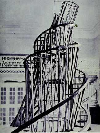
Famous artists of the Constructivist movement include Vladimir Tatlin (Architecture) which is known as the father of constructivism, Kasimir Malevich, Alexander Rodchenko ,and El Lissitzky. (both Graphic designer at the time)

Tatlin tower 1919

El lissitsky
 beat the whites with red wedge
1919 propoganda poster
  

Alexander Rodchenko
Lengiz books in all branches of knowledge 1925
poster 1929
 El Lissitsky photomontage


The elements of ‘Construction can be seen in these artists work as the use of symmetry, geometry and geometric shapes is very strong in their work. Another factor of the style is the use of sharp diagonal lined which give a sense of movement and dynamism to their work. The colour palette was always limited to few colours and the most common combination of colour that was used was red, white and black.From a Graphic Design point of view artists strictly used bold Sans Serif type which was also in line with their geometric ideology.

Constructivism was a very influential artistic movement and its legacy inspired later artists and artistic movement. The German design school Bauhaus was highly influenced by the constructivist works, Jan Tschichold was highly influenced by Alexander Rodchenko and El Lissitsky Graphic design.
Constructivism spread and made its way the west and in 1920 international Constructivism was founded and spaned until 1950s.

References


(all accessed 23/01/2014 @ 14:30)

The Thames and Hudson
 Dictionary of Graphic design and Designers
1992-98 Thames and Hudson Ltd, London

UK

DADA Movement

Dadaism was an art movement created in the early 20th century in Zurich, Switzerland (1915). This new art movement spread it influence in the west including Germany and the USA. This art movement was sparked after the First World War and was born from the negative reaction towards the horror of war. The movement aim was to protest against the bourgeois capitalist ideology society lead people to war.
The movement was made up of different individuals, with different disciplines, visual artists, literature, poets, art manifestos, art theory, theatre, and graphic design, and concentrated on rejecting of the traditional social ideology standards in art through anti-art cultural works.


Dada considered itself not art, but "anti-art." Everything for which art stood, Dada represented the opposite. Where art was concerned with traditional aesthetics, Dada ignored aesthetics. If art was to appeal to sensibilities, Dada was intended to offend.

The main founders of the dada movement included Hugo Ball, Emmy Hennings, Hans Arp, Raoul Hausmann, Hannah Höch, Johannes Baader, Tristan Tzara, Francis Picabia, Richard Huelsenbeck, George Grosz, John Heartfield, Marcel Duchamp, Man Ray, Beatrice Wood, Kurt Schwitters, and Hans Richter, among others. 
Individuals such as Tristan Tzara in 1918 created the DADA manifesto which served as the guideline and intents of the Dadaist.


”Dada does not mean anything.. We read
in the papers that the Negroes of the
Kroo race call the tail of the sacred cow:
dada. A cube, and a mother, in certain
regions of Italy, are called: Dada.
The word for a hobby-horse, a children's
nurse, a double affirmative in Russian
and Rumanian, is also: Dada."

- Tristan Tzara, Dada Manifesto


New Art techniques were emerging and started being used by the Dadaist. This made use of unconventional mediums and also embraced new technologies which emerged in the 20th century.
These include collages, photomontage, ready mades, and assemblage which wer utilised by different artist in the movement.


Example of ready made art by Marcel Duchamp

Fountain 1917
Example of photo montage and collage
Raoul Hausmann ABCD (Self-portrait)
 A photomontage from 1923-24
File:Hoch-Cut With the Kitchen Knife.jpg
Example of collage work
Hanah Hoch Cut with the Dada Kitchen Knife through
the Last Weimar Beer-Belly Cultural Epoch in German
1918


File:MechanicalHead-Hausmann.jpg
Example of Assemblage'Mechanical Head'Raoul Hausmann
1920


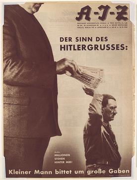
Example of photo montage on book cover'John Heartfield'
                
Dadaism made a large impact on the avante garde art movements and modernist art and was the starting point for other movments which came afterwords. Dada was the movement that lay the foundation for Surrealism and paved the groundwork to abstract art and sound poetry, a starting point for performance art, and a prelude to postmodernism. Later it would strongly influence influence pop art in the USA in the 50’s

References


(all accessed 23/01/2014 @ 13:00)

BOOK

GRAPICH DISGN REFERENCED
A visual guide to the language, application and history of graphic design 
Bryony Gomez-Palacio
and
Armin Vit
Published 2012
2009 by Rockport publishers
US
2Russian Constructivism