Sunday, 26 January 2014

Op Art


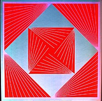
Op art or Optical art was a new style of art which developed out of the United States in the 1960’s. Op Arts invention of new abstract designs was inspired by the desire to create an art which relied on the use of optical illusions which would guide the eye and provided a distorted abstract expression. The use of optical illusions intent was to fool the viewer’s eyes. The Op artists were highly influenced by psychology and how the human brain worked.
n

The main influences of the style Neo-impressionism, Cubism, Futurism, Constructivism and Dada. Op art also was influenced from Trompe-l'œil and Anamorphosis elements.Victor Vasarely was the main figure who pioneered the movement with his 1938 painting Zebra. Important artist in the movment include Frank Stella and Ellsworth Kelly, Alexander Liberman, , Victor Vasarely, Richard Anuszkiewicz, Wen-Ying Tsai, and Bridget Riley whose art contributed immensely to the movement.

 CARACTERISITCS

• First and foremost, Op Art exists to fool the eye. Op compositions create a sort of visual tension, in the viewer's mind, that gives works the illusion of movement.

• geometrically-based nature, Op Art is, almost without exception, non-representational.

• The elements employed (color, line and shape) are carefully chosen to achieve maximum effect.

• perspective and careful juxtaposition of color

• positive and negative spaces in a composition are of equal importance. Op Art could not be created without both.

• Op Art represents a great deal of math, planning and technical skill


BRIDGETE RIELEY

Op art was a short lived movement which only spanned for 3 years. Although its life was brief optical art would be a great contribution and would be one of the influences for psychedelic movement in the US which would incorporate the elements of both op art and pop art.


REFERENCES

http://www.tfaoi.com/aa/7aa/7aa990.htm

http://arthistory.about.com/cs/arthistory10one/a/op_art.htm

http://www.artlex.com/ArtLex/o/opart.html


The Thames and Hudson
Dictionary of Graphic design and Designers
1992-98 Thames and Hudson Ltd, London UK


All accessed 24/1/2014 1100
ANDY WARHOL


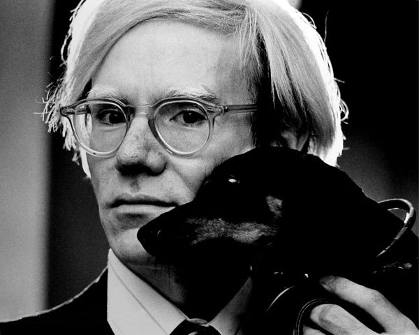
Andy Warhol was the quintessential figure that highly contributed to the pop art movement in the 50’s and 60’s.Warhol worked with Glamour magazine in and went on to become one of the most successful commercial artists of the 1950s. He won frequent awards for his uniquely whimsical style, using his own blotted line technique and rubber stamps to create his drawings.

In the late 1950s, Warhol began devoting more attention to painting, and in 1961, he pioneered the concept of "pop art"—paintings that focused on mass-produced commercial goods. In 1962, he exhibited the now-iconic paintings of Campbell's soup cans. These small canvas works of everyday consumer products created a major stir in the art world, bringing both Warhol and pop art into the national spotlight for the first time. 


Warhol art became more and more famous and his next step was the creation of his renowned celebrity portraits which h were portrayed in vivid and garish colours; his most famous subjects included Marilyn Monroe, Elizabeth Taylor,Mick Jagger and Elvis Presley . As these portraits gained fame and notoriety, alos did Warhol. He began to receive hundreds of commissions for portraits from socialites and celebrities.


Warhol's life and work simultaneously satirized and celebrated materiality and celebrity. On the one hand, his paintings of distorted brand images and celebrity faces could be read as a critique of what he viewed as a culture obsessed with money and celebrity. On the other hand, Warhol's focus on consumer goods and pop-culture icons, as well as his own taste for money and fame, suggest a life in celebration of the very aspects of American culture that his work criticized.

Andy Warhol contributed immensely to consumer art and his studio pioneers new techniques that portrayed art in context with the emerging society. Warhol was the Pioneer of introducing video as an art form. This today is seen as a common and run of the mil technique.


http://history1900s.about.com/od/artists/p/warhol.htm


http://www.warhol.org/


http://www.warholfoundation.org/


http://wiki.answers.com/Q/How_do_you_describe_Andy_Warhol's_art?#slide=1


All accessed 23/1/2014 2200

POP ART

Pop art emerged in the 1950s in Britain and the United States. The Pop art movement challenged the traditions of fine art by including imagery from popular culture such as advertising, news, etc. In pop art, material is sometimes visually removed from its known context, isolated, and/or combined with unrelated material. The concept of pop art refers not as much to the art itself as to the cultural and social attitudes that led to it. Pop art employs aspects of mass culture, such as advertising, comic books and everyday cultural objects. It is widely interpreted as a reaction to the then-dominant ideas of abstract expressionism,
Hamilton's 1956 collage Just what is it that makes today's homes so different, so appealing?


The popart movement main influence include Dadaism (collage and photo montage), cubism (abstraction) and surrealism. Pop art is aimed to employ images of popular notion as opposed to the traditional art form. It emphasises on the banal or kitschy elements of society, most often through the use of irony.Key Characteristics of Pop Art
Two important painters in the establishment of America's pop art vocabulary were Jasper Johns and Robert Rauschenberg. While the paintings of Rauschenberg have relationships to the earlier work of Kurt Schwitters and other Dadaists, his concern was with social issues of the moment. His approach was to create art out of common materials and using topical events in the life of everyday America gave his work a unique quality. Johns' and Rauschenberg's work of the 1950s is classified as Neo-Dada, and is visually distinct from the classic American Pop Art which began in the early 1960s. Of equal importance to American pop art is Roy Lichtenstein. His work probably defines the basic premise of pop art better than any other through parody. Selecting the old-fashioned comic strip as subject matter, Lichtenstein produces a hard-edged, precise composition that documents while it parodies.


CARACTERISTICS


· Recognizable imagery, drawn from popular media and products.

· Usually very bright colours.

· Flat imagery influenced by comic books and newspaper photographs.

· Images of celebrities or fictional characters in comic books, advertisements and fan magazines.

· In sculpture, an innovative use of media

Another important figure for the pop art movement was the American born artist Andy Warhol. He is famous for his re interpretation of commercial product imagery (Campbell soup) and also the use of popular figures and celebrities (silkscreen prints of Marylyn Monroe) made him no less than an icon of the style.


References

http://arthistory.about.com/od/modernarthistory/a/Pop-Art-Art-History-101-Basics.htm

http://guity-novin.blogspot.com/2010/06/chapter-33-pop-art.html

http://speckyboy.com/2012/01/16/20-things-you-didn%E2%80%99t-know-about-pop-art-
graphic-design/

The Thames and Hudson
 Dictionary of Graphic design and Designers
1992-98 Thames and Hudson Ltd, London UK


All accessed 23/1/2014 2100

Josef Muller-Brockman

Josef-Müller Brockmann, is said to be the father of Swiss Graphic Design, Brokmann’s work had a large impact upon the profession of graphic design. He is one of the most influential figures in Graphic design history and his professional contributions make him a recurring figure in books and editorial design. Brookman’s first studied architecture,design and history of art at both the University and Kunstgewerbeschule (school of arts and Crafts) in Zurich. Brokmann was also strongly influenced by designer Moholy-Nagy’s photography and Jan Tschichold’s rules of typography. ( both New typography movement).
 He began his career as a graphic designer as an apprentice to the designer and advertising consultant Walter Diggelman . In 1936, he left the advertising company and establishing his own Zurich studio specialising in graphics, exhibition design and photography. As a graphic designer, Müller Brickman’s used different techniques which included letterpress, silkscreen, and lithography.                                                                           Brockmann’s work revolved heavily on geometry and the use of the Grid, which produced a sense of Constructive graphic design. His approach toward the use of grids determined the organisation and arrangement of the type and images, which allowed better legibility. The grid is the hidden element that structures the composition as a whole.


Josef muller brokmann use of grid has been one of the greatest contribution towards the graphic design profession. He was the pioneer of design structure which will influence designers to use it and to break away from it in the years to come and still crucial to this day and age.

References.
http://guity-novin.blogspot.com/2011/07/chapter-42-swiss-grade-style-and-dutch.html
http://www.modern-theory.com/directories/muller-brockmann-josef/
http://www.agrayspace.com/ncsu/04_fall/img/Brockmann.pdf
http://www.pinterest.com/wakingup55/josef-muller-brockmann/

accesed 22/1/2014 2000

INTERNATIONAL TYPOGRAPHY

The International Typographic Style or Swiss design originated in Switzerland in the 1940s and 50s after World War 2. The Swiss typographic style was the basis of much of the development of graphic design during the mid 20th century. The International Typographic style developed and was influenced by previous avant-garde design, combining elements of Russian constructivism, Dutch De Stijl, New Typography t and the Bauhaus. The overall impression of the new style revolved around simplicity and rationality, tightly structured, clear, objective and harmonious.

Swiss Design view toward graphic design was to present complex information in structured and unified manner. The use of the Grid was a strong concept for the Swiss Designers. The pioneer figure which highly contributed and evolved the style were Ernst Keller, Theo Ballmer, Max Bill and Max Huber. Their work characteristics included reliance on the grid layout, the use of San Serif typeface (Helvetica 1961), narrow text columns which were set Ranged-Left and photography serving as the only source imagery on the page.


Characteristics of the style

The use of a mathematical grid
sans serif typefaces (especially Helvetica, introduced in 1961)
flush left and ragged right format; and
black and white photography

The international typographic style popularity starting growing and it extended till the 60’s and 70’s when new influences evolved the style further thanks to the influence of l designers Emil Ruder and Armin Hofmann (the Basel School of Design) and Josef Muller-Brockman(Zurich School of Arts and Krafts)  which refined the style and brought it in to a new level of sophistication.


The International style was to set the graphic design guidelines which would influence later styles. Spanning to the post-modernist style having evolved and manipulated and part of the corporate design  suggest further influence for the future of Graphic design sector.


The Thames and Hudson
 Dictionary of Graphic design and Designers
1992-98 Thames and Hudson Ltd, London UK


All accessed 22/1/2014 1830

New Typography Movement

The new typographic style started in the 1920s and 1930s, the so-called New Typography movement was a main factor and contributed graphic design and informational art of the artistic avant-garde in Central Europe.

El Lisstzky, a main figure in the constructivist artist played a major role and was considered a key figure in the development of the New Typography movement, he was one of the first designers to abandon the classical rules of typography and made use of  asymmetrical layouts, geometric shapes, a limited range of colours, and sans serif letter-forms.   He's considered the first person to apply modern art techniques to typography.   Lisstzky's principles will influence Maholy-Nagy and applied these graphic principles to the Bauhaus.

The main principles and characteristics of the New typographic style was a rejection to traditional arrangement of type in symmetrical columns, t designers started to organize the page or poster as a blank field in which blocks of type and illustration (frequently photomontage) could be arranged in harmonious, strikingly asymmetrical compositions. 
Contents in their designs would be arranged according to hierarchy.
Intentional use of white space was also evident and one of the main factors of the style.
Typefaces were strictly Sans Serif to accompany the geometric nature of the modernist philosophy. These new principles were important factors for paper size standardisation.
The new typographic style main artist included Jan Tschichold, Max Bayer, Ladislav Sutnar, Kurt Shwitters and Piet Zwart.

zwart1

bayer2


tschihold1

sutnar2

schwit1
rod1       


Jan Tschichold was a crucial figure of the new typographic style and in 1928he published his book, 'Die Neue Typographie' (German for "The New Typography). He aimed to make guidelines for a new era of typography in a time were the emphasis was on beauty and aesthetics Tschichold wanted to move away and change the traditional notions and introduced the principle of clarity and functionality. These guidelines helped with attaining clear, functional, and simplistic type that would also enhance the legibility of printed literature. Tschichold new guideline provided functional typography and its methods were quickly adopted be many printers and designers. This is when the New Typography movement really began to take off.
Jan Tschichold was responsible in creating new fonts in the mid early 20th century and the most famous typefaces he designed include
Typefaces Tschichold designed include: ‘Transit ‘(1931), ‘Saskia’(1931/1932), ‘Zeus’ (1931) and Sabon (1966/1967)


File:Sabon.png


The New Typography movement provided a much needed overhaul to typographic techniques in an age when new technology easily allowed typographers to experiment and adopt new approaches to arrange type on a page.  “Die Neue Typographie” by Jan Tschichold was the essential guideline that quickly caught on and helped birth a new era of typography.


References


The Thames and Hudson
 Dictionary of Graphic design and Designers
1992-98 Thames and Hudson Ltd, London UK


All accessed 22/1/2014 1400

Art Deco movement

Art Deco was established as Modern artistic style in France after WWI. Deco was highly influenced by industrialisation and technology which was transforming culture in the time. The new art style was influenced by Art nouveau but it distinguished itself and moved away from the organic motifs and adopted more of a geometric industrial look. The style combined traditional craft motifs with Machine Age imagery and materials
Art Deco represented luxury, glamour, exuberance, and embraced the technologies and machines.
Deco contributed to many areas of design in its time and was widely used in consumer products, which include cars design, architecture, graphic design, interior design, industrial design, fashion and cinema.This style flourished between the years of 1930 and 1940 and spread through the west.
 
Art Deco spire of the Chrysler Building in New York City;
designed by William Van Alen;
built 1928–1930.


File:Lempicka musician.jpg
Tamara de Lempicka, "The Musician",
1929 (oil on canvas).


Art Deco main characteristics include elements such as —geometric shapes, bold curves, strong vertical lines, motion lines, airbrushing and geometric patterns. In the 1930 the elements of aerodynamics started to emerge in art deco and this was the result with the obsession of manmade machines and their new obsession of speed and power. This new notion of aerodynamic would strongly influence train, automobile, and aeroplane design in the era.

Graphic design also adhered to these characteristics but made less use of ornate motifs and replaced them with striking geometric shapes, strong use of line in various angles and geometric patterns. Also the use of rectilinear typefaces was used which provided improved legibility.
Art Deco made an incredible impact on typography. A.M. Cassandre’s Bifur was a main typographer and created typeface for the era, the typefaces composed of thick base forms ornamented with thin filler lines.. Broadway and Peignot are two other Deco typefaces we see all the time.

                       
File:Peignot sample.png
Peignot typeface.

Broadway typeface


                     References
http://www.pinterest.com/thebigmachine/art-movements-art-deco/
http://99designs.com/designer-blog/2012/06/05/art-deco-a-strong-striking-style-for-graphic-design/
http://visualartsdepartment.wordpress.com/deco/
http://gds.parkland.edu/gds/!lectures/history/1925/artdeco.html

The Thames and Hudson
Dictionary of Graphic design and Designers
1992-98 Thames and Hudson Ltd, 

London UK